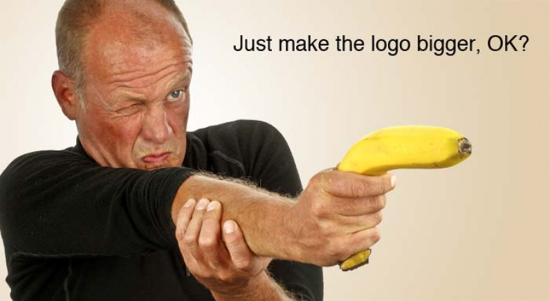
Why You Really Shouldn’t Make the Logo Bigger

It’s the request that every Graphic Designer dreads. The client really likes the design, apart from one thing. They don’t want to tell the designer how to do their job but, before they sign off, can the designer just ‘make the logo a bit bigger’?
From a brand and marketing perspective, this is a bad idea. Yes, as the client you’re paying the bill. Yes, you’ve invested in a professionally-designed logo and you want people to know who you are. And yes, you want the customer to buy from you and not a competitor. So doesn’t a bigger logo ensure that these goals are met?
Think about it from the customer’s point of view. They’re looking for a product or service to solve a particular problem. Or they may not even know that they have a problem. Your goal is to show them that you have the perfect solution. They may have never heard of you. They may not know a thing about you. What they really want to know, having been made aware that they do have problem, is how you can help them solve it. And, perhaps more importantly, how much will it cost? Putting it simply, they’re not that interested in your logo.
So instead of flashing your logo at them, talk about your product or your service. Tell the customer about what it offers and how it will solve their problem. Don’t talk about the features that make your product special. Instead tell them about the benefits that they will gain from using it. If you’re going to compare your product or service with the opposition point out the benefits that make your product or service better than the opposition’s.
At every stage of communication, from your banner or print ad, to your website, to your business card, your billboard and beyond, bring your brand into play. It’s here that you show them the whole package. Make sure that the correct colour palette and typefaces are used. Set a consistent tone and style for your written and visual communications. Take a consistent approach to the way you present your product or service. All these factors build your credibility with customers. By taking a ‘whole brand’ approach they will see that you’re so much more than just a big logo.
And then close with your call to action, logo, and contact details (what they should do next, who they should deal with and how to get in touch). This is the last part of your message that they will see, and the most important information they will retain.
Done.
